SSI Traffic Solutions: Traffic Safety Products in USA and Canada
Traffic Safety Products in USA and Canada

Choosing traffic signs is not just a matter of picking a shape and color. The right choice depends on where people travel, what they need to notice, and how quickly they must respond. A sign beside a school entrance faces different demands from one on a private access road or near a temporary work area. Look closely at vehicle speeds, sightlines, pedestrian movement, lighting, and nearby visual clutter. Small details matter.
Start with the sign’s purpose and the people who will read it. A clear message, readable lettering, and suitable size can help drivers recognize information in time. Material also matters: a sign exposed to strong sun, rain, or freezing conditions may need different construction from one in a sheltered parking area. Consider reflectivity for low-light visibility, along with mounting height, post placement, and maintenance access. These choices affect more than appearance. They can shape how reliably a sign performs over time.
Before ordering, compare the project plan with applicable local requirements and consult qualified traffic or signage professionals when conditions are complex. A supplier can explain material options, while a traffic engineer may help assess placement and visibility. No checklist replaces a site review. Even a carefully selected sign can be overlooked if a tree, parked vehicle, or bright storefront blocks the view. That assumption is easy to miss. This guide explores the practical questions that help project teams choose traffic signs suited to their setting, users, and operating conditions.
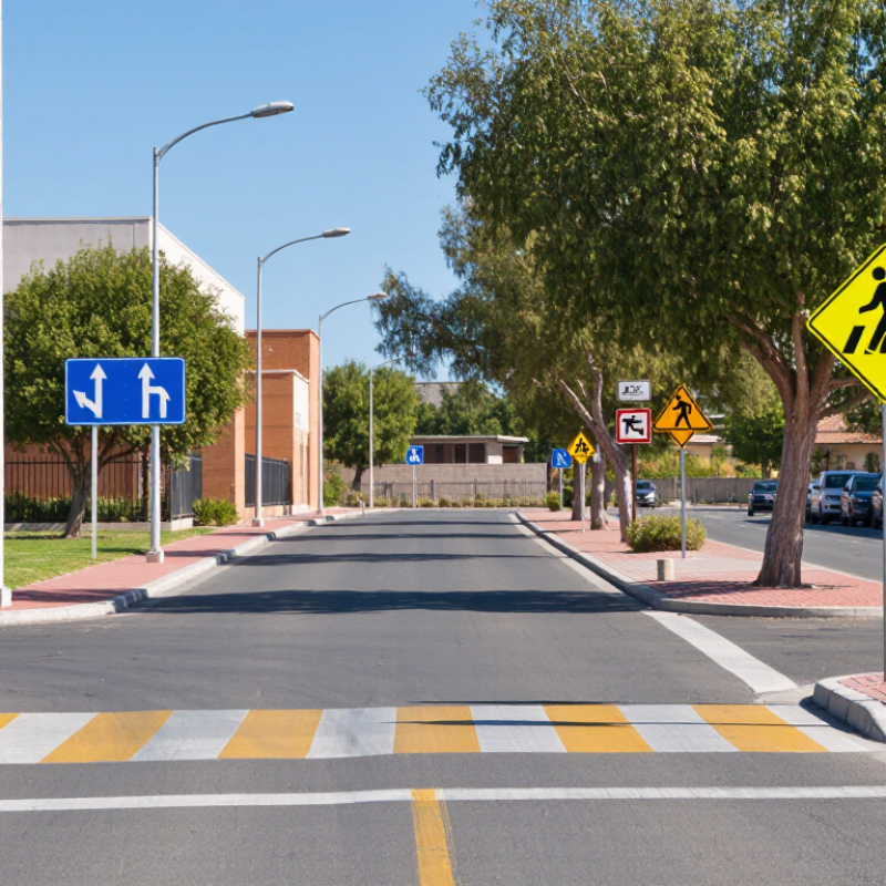
Before choosing traffic signs, map how people and vehicles move through the project area. Walk the site during busy and quiet periods. Note entrances, blind corners, loading zones, pedestrian crossings, and places where queues may form. A short utility repair needs different controls from a long-term construction entrance. Identify who needs guidance: drivers, cyclists, workers, visitors, or delivery crews. Be specific.
Tips: Sketch approach routes and mark decision points where people need information. Record speeds, sightlines, lighting, weather exposure, and work hours. Ask field staff where confusion already occurs. Small details matter. A temporary fence can block a sign. Easy to miss.
Then decide what action each sign should prompt: slow down, stop, detour, yield, or keep clear. Avoid clustering messages; people have little time to read while moving. Check that sign size, placement, and visibility suit the road environment. Compare the plan with applicable local traffic-control guidance, and ask a qualified traffic professional to review unusual or high-risk layouts. Keep notes as the work zone changes. The first layout may not be right; a walk-through after setup can reveal gaps.
Before selecting signs, map the project area and note how people, vehicles, and equipment move through it. Identify entrances, crossings, turning points, restricted areas, and places where visibility drops. A quick site walk can reveal a blocked sightline behind a parked truck or a confusing fork in the access road. Details matter.
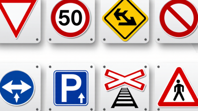
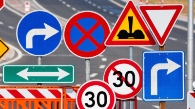
Then match sign types to the risks and decisions at each location. Regulatory signs communicate required actions or limits. Warning signs alert people to hazards such as sharp bends, uneven surfaces, or moving machinery. Directional and guide signs show routes, destinations, and exits. Work-zone signs may be needed where traffic patterns change or temporary hazards appear. Not every project needs every category. The layout matters.
Check the sign list against current local requirements and the project’s traffic or safety plan. A qualified traffic professional can help resolve unclear cases, especially near public roads or busy pedestrian routes. Keep a draft map with each sign’s purpose, location, viewing distance, and intended audience. Revisit it after deliveries, fencing, or equipment placement changes. One imperfect first pass is normal; leaving an assumption untested is not. A sign that looks clear on paper may be hidden at driver eye level, so review it from the approach path.
Use this planning guide to identify sign categories by project need. Sign colors, shapes, wording, dimensions, and placement must follow the standards and approvals applicable in your jurisdiction; examples below reflect common U.S. practice.
| Sign Type | When It May Be Required | Common Examples | Typical U.S. Appearance | Project Checks |
|---|---|---|---|---|
| Regulatory | To communicate traffic laws, restrictions, or required actions. | STOP, YIELD, speed limit, turn restrictions, no parking, one way | Often white, black, or red; STOP signs are red octagons and YIELD signs are red-and-white inverted triangles. | Confirm the restriction is legally authorized and that the sign is positioned where road users can see and act on it. |
| Warning | To alert drivers to a roadway condition or potential hazard ahead. | Curve, intersection, lane ends, narrow bridge, steep grade, pedestrian crossing | Commonly a black legend or symbol on a yellow diamond-shaped sign; some special warnings use other prescribed colors or shapes. | Identify the hazard, available sight distance, approach speed, and whether an advisory plaque or supplemental sign is needed. |
| Guide and Destination | To help road users navigate routes, destinations, streets, or facilities. | Route markers, street names, directional arrows, distance signs, parking direction | Colors vary by sign purpose; many U.S. guide signs use green backgrounds with white legends, while route markers have prescribed designs. | Check route authority, destination names, direction, legibility, and consistency with the approved wayfinding plan. |
| Temporary Traffic Control / Work Zone | When construction, maintenance, utility work, or an incident changes normal traffic conditions. | Road work ahead, lane closed, detour, flagger ahead, temporary speed limit | Commonly black legends on orange backgrounds in U.S. work zones; signs may be mounted on portable supports. | Coordinate signs with the temporary traffic-control plan, work stages, pedestrian access, and required removal or covering after work ends. |
| Pedestrian and Bicycle | Where people walking or cycling need crossing, route, or shared-use information. | Pedestrian crossing, bicycle route, shared-use path, trail direction | Appearance and color depend on the sign’s function and the governing standards; warning signs commonly use yellow or fluorescent yellow-green. | Review crossing location, visibility, accessible routes, bicycle movements, and conflicts with vehicle access points. |
| School Area | Near designated school routes, crossings, or school zones where specific warnings or controls are warranted. | School crossing, school zone, school speed limit | Fluorescent yellow-green is commonly used for school-related warning signs in U.S. practice; sign shape depends on its purpose. | Verify the designated school area, operating times, crossing treatment, and any authorization required for a school speed limit. |
| Railroad Crossing | Where a roadway approaches a rail crossing and signing is required by the applicable design and safety standards. | Railroad advance warning, crossbuck, number of tracks plaque | U.S. railroad advance warning signs are typically round and yellow; crossbucks are white with black lettering. | Coordinate with the rail authority and road agency; confirm track information, sight conditions, and any required active warning devices. |
| Parking and Facility Information | At entrances and within sites to direct drivers to parking, loading, accessible spaces, or site facilities. | Parking, accessible parking, loading zone, entrance, exit, emergency access | Design varies by jurisdiction and facility; accessible parking signs must meet applicable accessibility requirements. | Check local parking rules, accessibility requirements, facility circulation, and whether signs are on public or private property. |
Start with the site, not the catalog. A rural road, a shaded work zone, and a wet urban intersection place different demands on a sign. For many outdoor projects, aluminum offers a durable, corrosion-resistant base; reflective sheeting helps return headlight beams toward drivers. Match the sheeting grade to the road’s speed, lighting, and expected service life. Check the substrate and mounting details too. A good face on a weak post is still a poor installation.
Size the sign and its lettering for the actual viewing distance. Curves, parked vehicles, foliage, and complex backgrounds can shorten the time drivers have to read it. NHTSA’s Traffic Safety Facts: 2022 reports that 49% of traffic fatalities occurred in dark conditions. That makes nighttime visibility a practical design concern, not an optional extra. Use suitable retroreflective materials, and inspect them for dirt, fading, damage, or blocked sightlines. Small details matter.
There is no perfect material for every site. FHWA’s 11th Edition MUTCD calls for agencies to maintain traffic signs so they remain legible and visible, including at night. Apply the applicable sign specifications, then verify visibility from approaching drivers’ eye level. A sign may look clear at noon and vanish in rain. That deserves a second look.
Before choosing a sign, check the standards adopted by the road authority. In the United States, the Federal Highway Administration’s 2023 11th edition of the Manual on Uniform Traffic Control Devices sets requirements for sign design, placement, and use. Local rules may add details. Verify them before ordering. A compliant sign can still be poorly placed.
Walk the site in daylight and after dark. Note approach speed, sight distance, curves, parked vehicles, tree cover, glare, and where pedestrians actually cross. Measure the viewing distance, not just the available post location. Small details matter. A map never shows everything. The National Highway Traffic Safety Administration recorded 42,514 U.S. traffic deaths in 2022, in its annual traffic safety data. That figure does not show that a particular sign prevents crashes; it does underline the stakes of clear, timely information. Recheck visibility in rain or under headlight glare, and ask whether temporary work, seasonal foliage, or snow storage could hide the face. Field judgment is useful, but it can be wrong; document measurements and have another qualified reviewer inspect the proposed placement.
U.S. MUTCD standard STOP sign sizes vary by roadway context. Use this chart as a planning reference, then confirm the applicable standard and consider site conditions such as visibility and operating speed.
Source: U.S. Manual on Uniform Traffic Control Devices (MUTCD), Table 2B-1. Verify current federal, state, and local requirements before specifying signs.
A traffic sign works only when people can see and understand it in time.
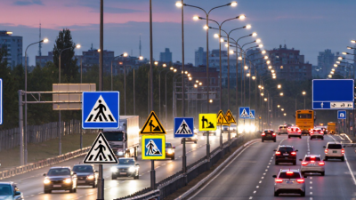
Map each sign location against approach speed, sight distance, curves, intersections, and likely pedestrian movement. Check the view from a driver’s seat, not just from the plan. Trees, parked vehicles, glare, and roadside clutter can hide a sign. Night visibility matters too. A site walk may reveal details the drawing missed.
During installation, confirm the post location and mounting height against local requirements and the project’s approved plans. Check for underground utilities before digging, and keep signs clear of sidewalks and accessible routes. Set each panel square to approaching traffic; even a slight twist can cause glare or reduce legibility. Use stable supports suited to the ground and weather. Some details are easy to overlook, so have another person inspect the finished installation.
Tips: Photograph each sign after installation and record its location. Recheck signs after storms, roadwork, or reported visibility problems. Look for fading, dirt, corrosion, loose fasteners, and blocked sightlines. Clean or replace damaged signs promptly, following applicable standards. A fixed inspection schedule helps, though the right interval depends on site conditions.